Three Pillars of Digital Professional Identity
In the modern professional landscape, your digital identity is not a single asset but a constellation of touchpoints that collectively shape how colleagues, clients, and prospects perceive you. Three elements have emerged as the foundational pillars of this identity: virtual backgrounds, email signatures, and bio pages. Understanding each pillar's unique role is the first step toward building a cohesive professional presence that works harder than any individual component could alone.
Virtual Backgrounds: The 70% Screen Advantage
During any video call, your virtual background occupies roughly 70% of the visible screen area. That is an extraordinary amount of visual real estate, yet most professionals either ignore it entirely or treat it as a casual afterthought. Consider what happens when you join a meeting with a branded virtual background: before you speak a single word, every participant absorbs your company name, colour palette, and visual identity. In an era where the average knowledge worker spends upward of 10 hours per week on video calls, that repeated exposure creates a powerful subconscious association between your face and your brand.
A well-designed virtual background does more than display a logo. It establishes context, signals professionalism, and provides a subtle but persistent reminder of who you represent. When every member of a team uses a coordinated background, the cumulative effect transforms routine meetings into brand-building moments.
Email Signatures: 121 Daily Opportunities
According to research from the Radicati Group, the average business professional sends and receives approximately 121 emails per day. Each outgoing message carries your email signature, making it one of the most frequently seen yet underutilized branding assets in your arsenal. Unlike social media posts that compete for attention in a crowded feed, an email signature arrives in a context where the recipient is already engaged with your message. The signature sits at the bottom of every reply, every forward, and every new thread, quietly reinforcing your professional identity dozens of times each day.
When that signature includes a consistent headshot, coordinated brand colours, and a link to your digital business card, it transforms a mundane piece of email metadata into an active lead-generation tool. The compounding math is striking: a team of 50 people collectively sends roughly 6,000 emails per day, each one carrying the brand into someone's inbox.
Bio Pages: The Central Hub
If virtual backgrounds create awareness and email signatures maintain it, bio pages serve as the central hub where that awareness converts into meaningful action. A bio page, sometimes called a digital business card or link-in-bio page, is the destination where all roads converge. It houses your contact details, social profiles, portfolio links, scheduling tools, and any other resource a prospect might need to take the next step.
The power of a bio page lies in its permanence and flexibility. Unlike a printed business card that becomes outdated the moment your phone number changes, a digital bio page on a platform like Lynqu can be updated instantly and shared through any medium. It is the single URL that unifies every other touchpoint in your professional ecosystem.
The Fragmentation Problem
The average professional today maintains a presence across five to eight different platforms. LinkedIn, email, video conferencing, a company website, perhaps a personal portfolio, various social channels, messaging apps, and industry-specific directories all compete for attention and maintenance. Each platform has its own profile format, its own image dimensions, and its own constraints on what information you can display. The result is an almost inevitable drift toward inconsistency.
Research from Lucidpress found that consistent brand presentation across all platforms can increase revenue by as much as 23%. Meanwhile, 68% of businesses report that brand consistency has contributed to revenue growth of 10% or more. These are not marginal gains. They represent the tangible financial impact of ensuring that every touchpoint tells the same story.
The fragmentation problem is not merely aesthetic. When a prospect sees one version of your headshot on LinkedIn, a different colour scheme in your email signature, and no branding at all on your video calls, the inconsistency erodes trust at a subconscious level. Studies consistently show that 71% of consumers are more likely to purchase from a brand they recognize. Recognition requires repetition, and repetition requires consistency.
For individual professionals, fragmentation means lost opportunities. A prospective client who receives your email, then joins a video call with you, then visits your bio page should experience a seamless visual journey. When each touchpoint feels disconnected from the others, you are effectively starting from zero with every interaction instead of building on the familiarity you have already established.
How to Connect the Three Pillars
Bridging the gap between virtual backgrounds, email signatures, and bio pages requires a deliberate integration strategy. The following four-step approach creates a self-reinforcing loop where each pillar drives traffic and attention to the others.
- Embed your bio link in your email signature. Every email you send should include a direct link to your digital business card. This is the simplest and highest-impact integration step. When a recipient wants to learn more about you, save your contact details, or find your social profiles, the link is right there in every message. Position it prominently, either as a clickable button or as a clear text link beneath your name and title.
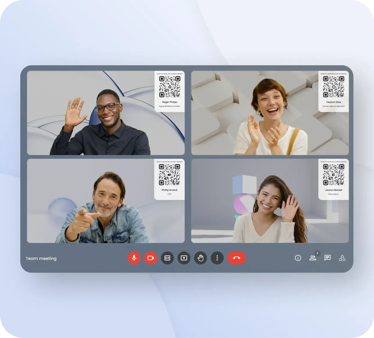
- Place a QR code on your virtual background. A small, well-positioned QR code in the corner of your virtual background gives meeting participants an instant path to your bio page. During a video call, attendees can simply point their phone camera at the screen to pull up your full contact details. This is particularly effective in larger meetings, webinars, and conference presentations where participants may not have a direct email thread with you.
- Create visual consistency across all three. Use the same colour palette, the same headshot, and the same logo treatment across your virtual background, email signature, and bio page. When someone sees your email and then joins a call with you, the visual continuity should be immediate and unmistakable. This does not mean making them identical but rather ensuring they feel like chapters of the same story.
- Include a scheduling link on your bio page. Complete the conversion loop by making it effortless for anyone who reaches your bio page to book time with you. Whether you use Calendly, Cal.com, or another scheduling tool, the link should be prominent on your bio page. This transforms the entire chain from passive branding into active lead generation: background creates awareness, signature drives clicks, bio page captures interest, and the scheduling link converts it into a meeting.
Creating Visual Consistency: A Practical Walkthrough
Visual consistency sounds straightforward in theory, but executing it well requires attention to specific details. Here is a step-by-step walkthrough for building a cohesive visual identity across all three pillars.
Lock Your Colour Codes
Choose two to three brand colours and document their exact hex codes. Your primary colour, secondary colour, and an accent colour are typically sufficient. Write them down, save them in a shared document, and use them everywhere. For example, if your primary brand colour is #1A73E8, that exact value should appear in your virtual background, your email signature links or accent elements, and your bio page theme. Approximations create visual noise. Exactness creates coherence.
Select Consistent Fonts
Choose one or two typefaces that you will use across all digital assets. A clean sans-serif for headings and a readable font for body text is a reliable combination. Ensure that the fonts you select are available across platforms. Your email signature may have limited font support, so choose web-safe options or fonts that degrade gracefully. Your Lynqu bio page gives you more typographic freedom, but it should still feel related to the fonts in your other touchpoints.
Standardize Your Headshot
Use the same professional headshot everywhere. Not a similar one, not one from the same photo session, but the exact same image. This is one of the most important consistency factors because human faces are what people remember most readily. If your LinkedIn headshot shows you in a blue shirt and your email signature shows you in a grey jacket, the subconscious disconnect undermines recognition. Update your headshot annually or whenever your appearance changes significantly, and update it everywhere simultaneously.
Logo Sizing and Placement
For email signatures, logo dimensions between 80 and 120 pixels in width tend to work best. Larger logos can appear aggressive and may trigger spam filters; smaller logos become illegible on mobile devices. On your virtual background, the logo should be visible but not dominant, typically positioned in a corner at a size that remains readable on a typical laptop screen. On your bio page, the logo or brand mark should anchor the top of the page, establishing identity before the visitor scrolls.
Build a Brand Asset Kit
Compile all of these elements into a single shared folder: hex codes, font names, approved headshot, logo files in multiple formats, and example implementations for each pillar. This kit becomes the single source of truth for anyone on your team who needs to create or update their professional touchpoints. It eliminates guesswork and prevents the gradual drift that causes inconsistency over time.
Team Deployment Strategy
The mathematics of team deployment are compelling. If a single professional sends approximately 40 branded emails per day, a company of 100 people generates roughly 4,000 branded email impressions every single day. Over a month, that is 80,000 impressions, each one carrying consistent branding, a link to a bio page, and a professional headshot. No advertising campaign delivers that kind of frequency to such a targeted, already-engaged audience.
Centralized Templates
Create master templates for all three pillars. A virtual background template with locked logo placement zones, an email signature template with defined fields and formatting, and a bio page template with standardized sections. Platforms like Lynqu make this particularly straightforward for bio pages, offering team-wide templates that maintain brand consistency while allowing individual personalization of contact details and links.
Wave Rollout
Deploying a new integrated branding strategy across an entire organization at once is a recipe for confusion and support tickets. Instead, use a wave approach. Start with a pilot group of 10 to 15 enthusiastic early adopters, ideally from customer-facing roles. Refine the templates based on their feedback, then expand to department-level rollouts over a period of four to six weeks. Each wave benefits from the lessons of the previous one.
Brand Champions
Designate one or two brand champions per department. These individuals serve as the first point of contact for questions about backgrounds, signatures, and bio pages. They ensure that new hires are set up correctly from day one and that updates propagate through their team without requiring intervention from marketing or IT. Brand champions should have direct access to the brand asset kit and the authority to approve minor customizations.
Quarterly Audit
Schedule a quarterly review to ensure consistency has not drifted. Check a random sample of email signatures, review the virtual backgrounds in use during recent meetings, and spot-check bio pages for outdated information. Even the best-intentioned teams experience drift over time as people change roles, update their photos independently, or experiment with alternative layouts. A regular audit catches these issues before they compound.
The Compounding Effect
Psychology offers a powerful explanation for why integrated branding works: the mere-exposure effect. First documented by psychologist Robert Zajonc, this phenomenon describes the human tendency to develop a preference for things simply because we encounter them repeatedly. Each time a prospect sees your consistent branding, whether on a video call, in their inbox, or on your bio page, their familiarity and comfort with your brand increases incrementally.
Research from HubSpot suggests that it takes an average of eight touchpoints to generate a viable sales lead. If your virtual background, email signature, and bio page are all working as cohesive touchpoints, three interactions with you can deliver three distinct yet unified brand impressions. That means three cohesive touchpoints get you halfway to conversion before a formal sales conversation ever begins.
The compounding effect extends beyond individual relationships. When every member of your team projects the same visual identity, prospects who interact with multiple team members experience an accelerated version of the mere-exposure effect. A client who has a video call with your sales representative, exchanges emails with your account manager, and visits a bio page shared by your CEO encounters the same brand three times through three different people, and each encounter reinforces the others.
Measuring the Integrated Strategy
An integrated strategy is only as good as your ability to measure its impact. Here are the key metrics to track across each pillar.
- Bio page views. Track the total number of visits to your digital business card over time. A rising trend indicates that your other touchpoints are successfully driving traffic to your central hub. Segment by referral source to understand whether clicks are coming primarily from email signatures, QR scans, or direct shares.
- Contact save rate. The percentage of bio page visitors who save your contact information is one of the most meaningful conversion metrics. A well-optimized bio page with a clear call to action typically sees save rates between 15% and 30%. If your rate falls below this range, review the page layout, the prominence of the save button, and whether the page loads quickly on mobile devices.
- Email signature click-through rate. Most email signature management tools can track how often recipients click the links in your signature. Industry benchmarks for signature CTR typically fall between 1% and 3%. While that may sound modest, applied across thousands of daily emails, it translates into a meaningful volume of engaged visitors reaching your bio page.
- QR code scan rates. If you include a QR code on your virtual background, track how many scans it generates. This metric is particularly useful for measuring engagement during webinars, presentations, and large meetings where participants are less likely to follow up via email but may scan a code in the moment.
Case Study Framework: Before and After
To quantify the impact of an integrated strategy for your own situation, follow this before-and-after measurement framework.
Establish a 30-Day Baseline
Before making any changes, measure your current state for a full 30 days. Record your bio page views, contact save rate, email signature clicks (if trackable), and any other relevant metrics. Document the current state of your virtual background, email signature, and bio page, including screenshots for visual reference. This baseline becomes the benchmark against which you measure all future improvements.
Implement and Measure Over 90 Days
Deploy your integrated strategy and measure the same metrics over a 90-day period. The longer measurement window accounts for natural fluctuations in meeting schedules, email volume, and seasonal business patterns. Compare the 90-day averages against your 30-day baseline to calculate the true impact.
Typical Results
Organizations and individuals who implement a fully integrated strategy across all three pillars typically see a 30% to 50% increase in bio page traffic driven by the addition of links in signatures and QR codes on backgrounds. Contact save rates tend to improve by 20% to 40% as the visual consistency between the referral source and the bio page builds trust and reduces friction. These are not theoretical projections; they reflect the patterns observed across professionals who treat their digital identity as an integrated system rather than a collection of disconnected profiles.
Common Integration Mistakes
Even well-intentioned integration efforts can be undermined by a handful of common mistakes. Awareness of these pitfalls helps you avoid them from the outset.
- Inconsistent logos. Using different versions of your logo across touchpoints is one of the most frequent errors. An outdated logo in your email signature, a different colour variant on your virtual background, and the current version on your bio page create exactly the kind of fragmentation you are trying to eliminate. Audit all touchpoints and ensure every logo file comes from the same approved source.
- Outdated email signatures. People change roles, earn new titles, and switch phone numbers, but their email signatures often lag months behind. An outdated signature is worse than no signature at all because it actively provides incorrect information. Set calendar reminders to review your signature at least quarterly.
- Broken QR code links. If you change your bio page URL after printing QR codes or embedding them in virtual backgrounds, every existing code becomes a dead end. Use a permanent URL for your bio page, one that will not change even if you update the underlying content. Platforms like Lynqu provide stable URLs that persist through any number of content updates.
- Mismatched headshots. As discussed earlier, using different photos across touchpoints fragments recognition. But a subtler version of this mistake involves using the same photo at different crop ratios or with different colour treatments. Ensure the exact same file is used everywhere, cropped to each platform's requirements but never altered in colour or composition.
- Ignoring dark mode. A growing percentage of professionals use dark mode on their email clients, browsers, and operating systems. If your email signature or bio page only looks correct on a light background, you are delivering a broken experience to a significant portion of your audience. Test every touchpoint in both light and dark mode and adjust colours, logo variants, and contrast accordingly.
- Overloaded email signatures. The temptation to cram every social link, certification badge, legal disclaimer, and promotional banner into an email signature is understandable but counterproductive. An overloaded signature overwhelms the recipient and dilutes the impact of every individual element. Limit your signature to the essentials: name, title, company, phone, one or two links, and a headshot. Let your bio page handle the rest.
Quarterly Review Checklist
Consistency is not a one-time achievement. It requires ongoing maintenance. Use this seven-step quarterly checklist to ensure your integrated strategy remains effective over time.
- Update your bio page. Review every section of your digital business card for accuracy. Check that your title, company, contact details, social links, and scheduling URL are all current. Remove any links that are no longer relevant and add any new ones that support your current objectives.
- Refresh your virtual background. Ensure your background reflects your current branding, including any recent logo updates or colour palette changes. If your company has seasonal campaigns or event-specific branding, update the background to align with the current initiative. Verify that any QR code on the background still resolves to the correct destination.
- Check your QR codes. Scan every QR code you have in circulation, on your virtual background, printed materials, presentation slides, and anywhere else. Confirm that each one loads your current bio page quickly and correctly on both iOS and Android devices.
- Review your email signature. Verify that your name, title, phone number, and all links are accurate. Check that your headshot matches the one on your other touchpoints. Send a test email to yourself and view the signature on both desktop and mobile, in both light and dark mode.
- Audit visual consistency. Place a screenshot of your virtual background, your email signature, and your bio page side by side. Do they look like they belong to the same person and the same brand? Check colour accuracy, logo placement, headshot consistency, and overall visual tone. Any discrepancy you notice will also be noticed, consciously or not, by the people you interact with.
- Check your analytics. Review the metrics discussed earlier: bio page views, contact save rates, signature click-through rates, and QR scan volumes. Compare the current quarter against the previous one. If any metric has declined, investigate the cause. A drop in bio page views might indicate a broken link in your signature; a decline in save rates might suggest the page needs a content refresh.
- Update your team. If you manage a team, ensure all members have current templates and assets. Check that new hires have been set up with the correct virtual background, email signature, and bio page. Share any updates to the brand asset kit and confirm that brand champions in each department are aware of any changes. A brief quarterly email summarizing what has changed and what to check is usually sufficient to maintain alignment across even large teams.
Building an integrated professional identity across virtual backgrounds, email signatures, and bio pages is not about adding complexity to your daily workflow. It is about making the touchpoints you already use work together instead of in isolation. When these three pillars are aligned, every video call, every email, and every bio page visit compounds the others, building recognition, trust, and ultimately, results. Start with your Lynqu digital business card as the central hub, then extend that identity outward to every screen where your professional presence appears.